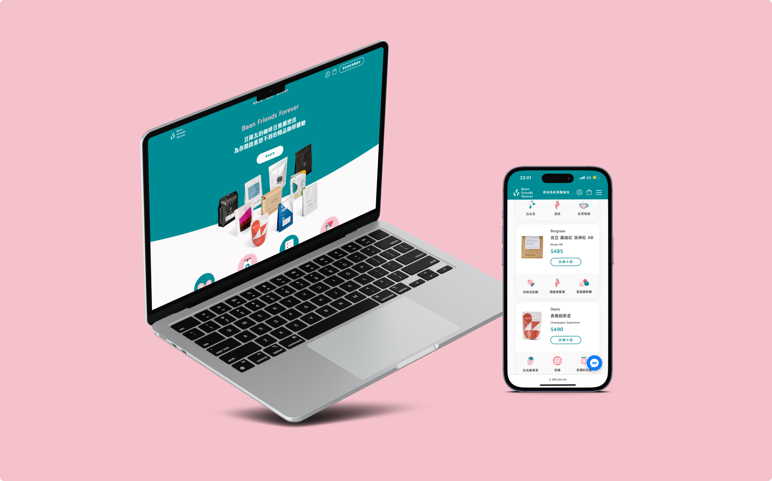
Bean Friends Forever is the first ever coffee subscription service in Taiwan, providing in-time and flexible coffee supplies from independent roasters to end customers with algorithm-based personalized recommendations.
Time
Aug 2020 - Aug 2022
my role
UX Researcher & Designer, post-launch UI Designer
I grew with the brand and platform from scratch and was in charge of ongoing UX research, UX design and post-launch UI design activities.
Disclaimer: For confidentiality reasons, details of research findings and design process will be omitted in this case study.
the goal
The goals of this platform derive from challenges in current Taiwan specialty coffee industry, where coffee purchase activities of end consumers are lack of a easy-breezy go-to online service, enabling them to get varieties of great quality coffee beans, as well as precise recommendations based on personal preferences. Given such, the purpose of Bean Friends Forever is to provide:
ux research focus
Interviews and synthesis were done to conduct coffee buyer profiling. The research focus was to find the target persona and understand their behaviors and unmet needs in the 2 aspects:
Subscription service catered to personal consumption needs: What are the pains and frustrations on getting coffee beans from roasters?
Coffee flavor matches to personal preferences: What are the pains and frustrations on getting the right beans?
research findings
Pains and frustrations on getting coffee beans from roasters can be mainly categorized into below 3 aspects, and pains and frustrations on getting the right beans actually resonate with the first pain in pains and frustrations when getting coffee beans from roasters.
Choice of beans
Bean supply issues
Current purchasing process
UX Design & Iteration Focus
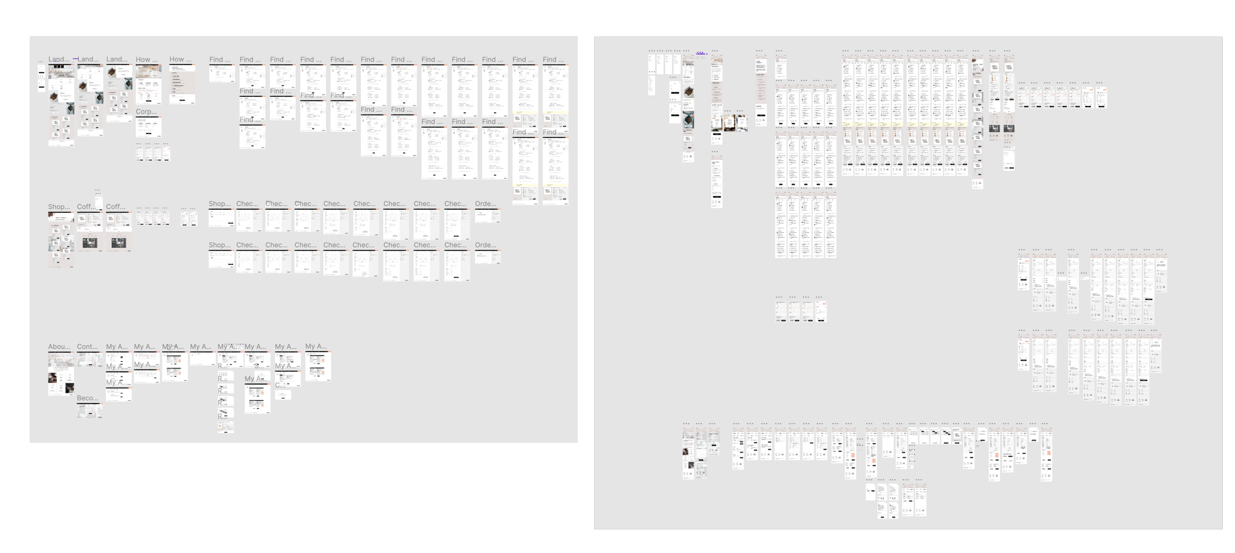
Based on the key findings, design elements were conceived and fused into the initial design of this online service, and further developed into the prototypes. Both desktop and mobile version of prototypes gone through 2 rounds to testing and iterations. I also designed A/B testing for key user flows of the service.
learning from usability test
Overall speaking, there’re 3 major learning from 2 rounds of usability test.
Content strategy including copywriting and precise choices on vocabularies and paragraph length and what not, plays an crucial role when introducing a new service, as important as information architecture, user flow and visuals.
Digging deeper, “micro information architecture”, meaning the information each section of a single page presents, needs careful consideration and delicate design to communicate effectively to users.
Users aren’t lazy, they just want to be efficient. It’s especially important on smaller screen size.
Learning from A/B testing on crucial user flows:
Check-out flow: improve efficiency while providing sense of security.
Quiz flow: balance between having fun elements while showing a professional image.
The Final Touch – Collaboration with CI & UI
From discussion with CI Designer, we landed on 2 key factors of how the look and feel of this platform should be.
The tone will be bright, elegantly cute, friendly and with a bit sense of humor.
As for the visuals, we could disassemble the elements of logomark and re-assemble them into visuals including icons or patterns.
I prepared comprehensive web design requirement documents and brief to UI designer on
Goals and purpose of this platform
CI wise – branding guidelines
Interaction wise – Information Architecture, key design principles defined during UX design process and from usability testing insights
RWD requirements
After UI design was done, I acted as focal point to collaborate with front-end developers; explaining the design components, site structures and interactions, and auditing the development outcome to ensure it aligns with what was expected.


